Using Add Record Page Object
Below are the tutorials for creating back-end page and its functionality using 'Add Record' page object. Let's say, you've built a Desktop Computer Catalog module and now you wish to create a 'Add Desktop' page in enabling you to add records manually in the back-end system. |
Create Page Object
|
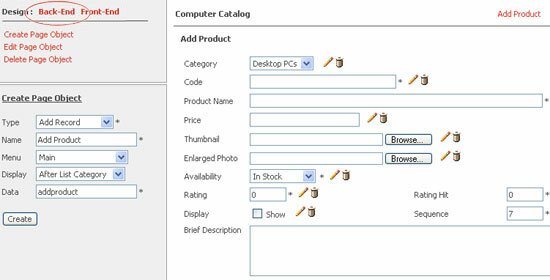 |
- Login to your One Admin area and click on the 'Desktop Computer Catalog' in the module's pane to run module through back-end system. Otherwise, click on the Pro button in the One Admin panel to access Modules Builder Pro and create 'Desktop Computer Catalog' module.
- Once you have completed step 1, proceed to module's Launch Builder and a page similar to above will prompt out. On this page, select Back-End design area and create a form using 'Add Record' page object.
- Next, enter page's 'Name', e.g. 'Add Desktop' and select its menu location either as main menu or submenu. Then, select a location to display 'Add Desktop' link in the menu panel, e.g. 'At Beginning'.
- Also, enter the 'Data' source name for 'Add Desktop' page (Table's name in your database), e.g 'desktop_desktops'. Subsequently, click on the 'Create' button once you're done.
|
Insert Form's Fields
|
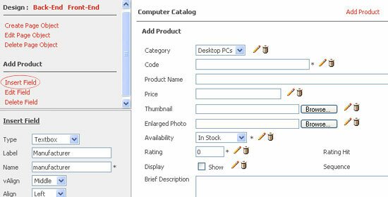 |
- On the same page as previous screenshot, click on the Add Field to insert new fields in 'Add Desktop' form such as textbox, dropdown menu, radio button, checkbox, HTML editor, etc.
- Otherwise, click on the Edit Field to select any field that you want and click on the
 icon. There are different type of fields in which you can select from. icon. There are different type of fields in which you can select from.
Textbox
- Label - Insert or edit field's label that will display in your form adjacent to the textbox, e.g. 'Manufacturer'.
- Name - This is your database field name, e.g. manufacturer. Keep the name short, no space is allowed, and cannot be left blanked.
- vAlign & Align - Select field's alignment such as 'vAlign' (Top, Middle or Bottom) and 'Align' (Left, Center or Right).
- Location - Choose the display location for your textbox in your form either on the Left or Right.
- Display - Place your textbox on top in your form before other fields or choose to display textbox within existing fields.
- Width - Set your textbox size in pixel.
- Value - Add or edit text and value that you wish to assign to this field. Write a short tips if necessary to give users a hint of what to input in the textbox. If the value you wish to use is PHP code, click on the below checkbox to 'Interprete field's value as PHP code'. For example, you may wish to use return date("Y-M-D"); as your field's value.
Textarea
- Label - Insert or edit field's label that will display in your form adjacent to the textarea, e.g. 'Brief Description'.
- Name - This is your database field name, e.g. description. Keep the name short, no space is allowed, and cannot be left blanked.
- vAlign & Align - Select field's alignment such as 'vAlign' (Top, Middle or Bottom) and 'Align' (Left, Center or Right).
- Location - Choose the display location for your textarea in your form either on the Left or Right.
- Display - Place your textarea on top in your form before other fields or choose to display textarea within existing fields.
- Width & Row - Set field's width in pixel and number of rows (height) of your textarea. .
- Value - Add or edit text and value that you wish to assign to this field. Write a short tips if necessary to give users a hint of what to input in the textarea. If the value you wish to use is PHP code, click on the below checkbox to 'Interprete field's value as PHP code'. For example, you may wish to use return date("Y-M-D"); as your field's value.
Selection - Display multiple options in a drop down list.
- Label - Insert or edit field's label that will display in your form adjacent to the drop down box, e.g. 'Product Type'.
- Name - This is your database field name, e.g. type. Keep the name short, no space is allowed, and cannot be left blanked.
- vAlign & Align - Select field's alignment such as 'vAlign' (Top, Middle or Bottom) and 'Align' (Left, Center or Right).
- Location - Choose the display location for your drop down box in your form either on the Left or Right.
- Display - Place your drop down box on top in your form before other fields or display it within existing fields.
- Validation - Validate field, e.g. Not Empty, Is Integer, or Is Email.
- Multiple & Size - Enable this option to allow multiple selection and enter how many options to be displayed in this field.
- Select Options - You can get value from module's table or database.
- Get value from table - Select which module's table that you wish to get the option values from.
- Get value from database - Select which database table that you wish to get the option values from.
OR
You can also manually add multiple option selections into this field. Enable 'Set as default value' to set option as default. Click on 'Save' button once you're done.
Radio Button
- Label - Insert or edit field's label that will display in your form adjacent to the radio button, e.g. 'Gender'.
- Name - This is your database field name, e.g. gender. Keep the name short, no space is allowed, and cannot be left blanked.
- vAlign & Align - Select field's alignment such as 'vAlign' (Top, Middle or Bottom) and 'Align' (Left, Center or Right).
- Location - Choose the display location for your radio button in your form either on the Left or Right.
- Display - Place your radio button on top in your form before other fields or choose to display radio button within existing fields.
- Validation - Validate field, e.g. Not Empty, Is Integer, or Is Email.
- Select Options - You can get value from module's table or database.
- Get value from table - Select which module's table that you wish to get the option values from.
- Get value from database - Select which database table that you wish to get the option values from.
OR
You can also manually add multiple option selections into this field. Enable 'Set as default value' to set option as default. Click on 'Save' button once you're done.
Checkbox
- Label - Insert or edit field's label that will display in your form adjacent to the checkbox, e.g. 'Product Type'.
- Name - This is your database field name, e.g. type. Keep the name short, no space is allowed, and cannot be left blanked.
- vAlign & Align - Select field's alignment such as 'vAlign' (Top, Middle or Bottom) and 'Align' (Left, Center or Right).
- Location - Choose the display location for your checkbox in your form either on the Left or Right.
- Display - Place your checkbox on top in your form before other fields or choose to display checkbox within existing fields.
- Validation - Validate field, e.g. Not Empty, Is Integer, or Is Email.
- Select Options - Get Value from module's table or database.
- Get value from table - Select which module's table that you wish to get the option values from.
- Get value from database - Select which database table that you wish to get the option values from.
OR
You can also manually add multiple option selections into this field. Enable 'Set as default value' to set option as default. Click on 'Save' button once you're done.
Date - The  icon is shown by default when you create this field. icon is shown by default when you create this field.
- Label - Insert or edit field's label that will display in your form adjacent to this field, e.g. 'Date'.
- Name - This is your database field name, e.g. date. Keep the name short, no space is allowed, and cannot be left blanked.
- vAlign & Align - Select field's alignment such as 'vAlign' (Top, Middle or Bottom) and 'Align' (Left, Center or Right).
- Location - Choose the display location for your field in your form either on the Left or Right.
- Display - Place your field in the beginning of your form before other fields or display it within existing fields.
- Width - Set your field size in pixel.
- Value - Add or edit text and value that you wish to assign to this field. Write a short tips if necessary to give users a hint of what to input in the field. If the value you wish to use is PHP code, click on the below checkbox to 'Interprete field's value as PHP code'. For example, you may wish to use return date("Y-M-D"); as your field's value.
- Validation - Validate field, e.g. Not Empty, Is Integer, or Is Email.
File - This field enable users to upload documents and images in JPG, GIF, DOC, PDF format.
- Label - Insert or edit field's label that will display in your form adjacent to textbox, e.g. 'File'.
- Name - This is your database field name, e.g. file. Keep the name short, no space is allowed, and cannot be left blanked.
- vAlign & Align - Select field's alignment such as 'vAlign' (Top, Middle or Bottom) and 'Align' (Left, Center or Right).
- Location - Choose the display location for your field in your form either on the Left or Right.
- Display - Place your field on top in your form before other fields or display it within existing fields.
- Width - Set your field size in pixel.
- Validation - Validate field, e.g. Not Empty, Is Integer, or Is Email.
Text/Label
- Label - Insert or edit text or label to display in your form.
- Name - This is your database field name. Keep the name short, no space is allowed, and cannot be left blanked.
- vAlign & Align - Select field's alignment such as 'vAlign' (Top, Middle or Bottom) and 'Align' (Left, Center or Right).
- Location - Choose the display location for your label in your form either on the Left or Right.
- Display - Place this field on top in your form before other fields or display it within existing fields.
Hidden - This field is not visible to the public in the front-end web page. It is use as counter, status (pending or active), etc.
- Label - Insert or edit text or label to display in your form.
- Name - This is your database field name. Keep the name short, no space is allowed, and cannot be left blanked.
- vAlign & Align - Select field's alignment such as 'vAlign' (Top, Middle or Bottom) and 'Align' (Left, Center or Right).
- Location - Choose the display location for your field in your form either on the Left or Right.
- Display - Place this field on top in your form before other fields or display it within existing fields.
- Width - Set field's width in pixel.
- Value - Add or edit text and value that you wish to assign to this field. Write a short tips if necessary to give users a hint of what to input in the field. If the value you wish to use is PHP code, click on the below checkbox to 'Interprete field's value as PHP code'. For example, you may wish to use return date("Y-M-D"); as your field's value.
HTML Editor
- Label - Insert or edit text or label to display in your form.
- Name - This is your database field name. Keep the name short, no space is allowed, and cannot be left blanked.
- vAlign & Align - Select field's alignment such as 'vAlign' (Top, Middle or Bottom) and 'Align' (Left, Center or Right).
- Location - Choose the display location for this HTML editor in your form either on the Left or Right.
- Display - Place your field on top in your form before other fields or display it within existing fields.
- Width & Height - Set field's width and height in pixel.
- Value - Add or edit text and value that you wish to assign to this field. Write a short tips if necessary to give users a hint of what to input in the field. If the value you wish to use is PHP code, click on the below checkbox to 'Interprete field's value as PHP code'. For example, you may wish to use return date("Y-M-D"); as your field's value.
- Validation - Validate field, e.g. Not Empty, Is Integer, or Is Email.
- Toolbar - Choose toolbar type either Default, Basic or BasicNoFont.
|
Define Field's Value
|
 |
- Create field's 'Value' by simply enter its text and specific value that you wish to assign to this field. Write a short tips if necessary to give users a hint of what to input in the field.
- If the value you wish to use is PHP code, click on the below checkbox to 'Interprete field's value as PHP code'. For example, you may wish to use return date("Y-M-D"); as your field's value. Click on the 'Save' button once you're done.
|
Get Value From Module's & Database Tables
|
 |
- When you create specific fields such as 'Multiple Selection', 'Radio Button' and 'Checkbox', you can easily get option values from module's 'Table' or from your existing 'Database'.
- To get value from available module's table, click on the 'Table' tab and select which Module's Table that you wish to get the option values from. Then, select any Field Name to get its 'Label' and 'Value'. Subsequently, click on the 'Assign' button.
- Or, you can click on the 'Database' tab and select your Database Table that you wish to get the option values from. Then, select which Field Name to get its 'Label' and 'Value'. Subsequently, click on the 'Assign' button.
- Alternatively, you can manually add multiple Labels and Values into 'Multiple Selection', 'Radio Button' and 'Checkbox' fields. Click on the 'Set as default value' checkbox to select specific option as default. Click on the 'Save' button once you're done.
|
Back-End Administration Area
|
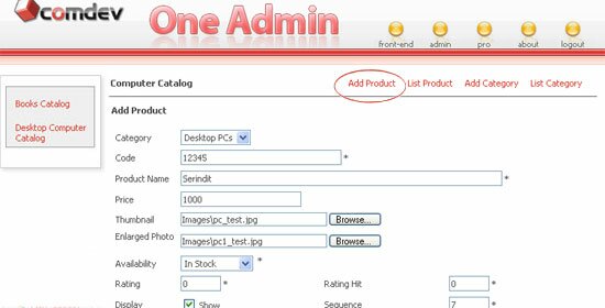 |
Your 'Add Desktop' page will appear in your back-end admin area. You can now add record manually and save it into the database. |
|
|
The Improved Version of Modules Builder Pro 4.1
We have released the Modules Builder Pro 4.1 (One Admin Pro) with new enhanced features and the One Admin 4.1 platform has been updated as well. Please refer to our knowledgebase article to download the updates and view the update guidelines.
>> What's new in Modules Builder Pro 4.1
|
Shop with Confidence

|
| • |
Risk Free Trial |
| • |
Free Installation |
| • |
Cost Saving Discount |
| • |
24/7 Secure Ordering |

|
FREE download modules packages, install them and customise features.
Click here >>>
|
|